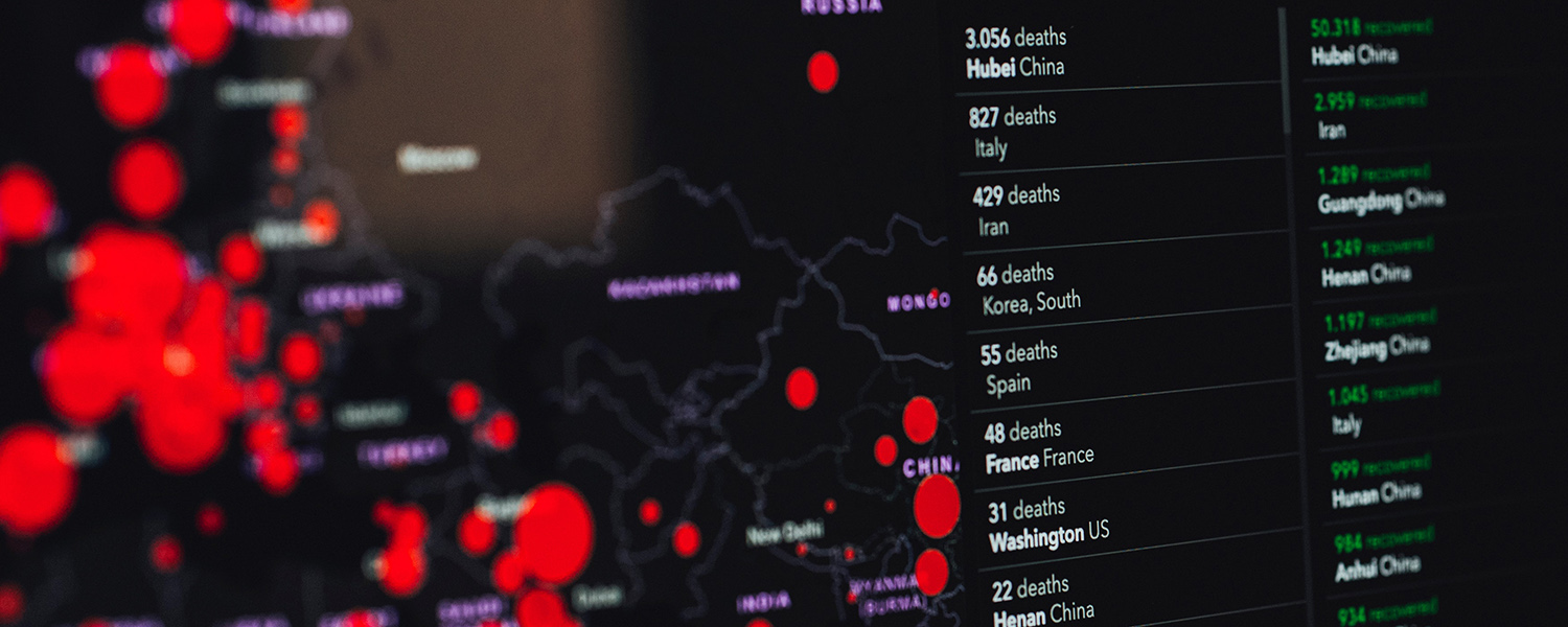
The United States is a week or two behind Italy — or so we’ve heard for at least a week. The basis of this claim is a comparison of the growing Covid-19 case counts in the two countries, often focused on the graph made by Financial Times journalist John Burn-Murdoch.
Do these comparisons between countries make sense? If we were really just behind Italy, how would we know?
According to the Financial Times graph, the United States as of Sunday is on a worse trajectory than any other country — meaning that, now on the 18th day since its hundredth confirmed case, it has more cases than any other country did at the same stage. On the other hand, South Korea, whose swift response to the pandemic has been hailed as a model for other countries to follow, actually looked worse than Italy for a while, with cases growing more quickly over the first two weeks of its outbreak before leveling off.
The problem with these comparisons is that they are, in myriad ways, not comparing apples to apples. It is well known that the United States has lagged badly in its testing. The “cases” on these charts are only discovered cases. Notably, although testing is improving, shortages remain severe: In New York City and Los Angeles County, hospitals have suspended testing for patients for whom the result would not change their treatment.
Some critics have thus objected that America’s ballooning growth in cases really reflects expanded testing rather than a booming pandemic. On this view, America’s reward for finally getting its testing game together is to be penalized with exaggerated alarm.
The truth is surely a combination of these two factors. Some of the growing case count reflects new cases, and some of it reflects old cases just now discovered. There is no simple way to tease out which is which, to arrive at the actual rate of new cases.
What if instead we look at the increasing number of deaths? Laura Kahn, a Princeton University health policy scholar, told us by phone that we can be reasonably confident that, while we may be failing to identify many milder cases of Covid-19, we have probably identified most of the people who have died of the disease in the U.S.
The Financial Times has a graph for this too. Here, things look better for the United States than they did for Italy at this stage of its outbreak — we have suffered fewer deaths so far. But we also appear to be closing the gap.
Here, too, we still may not be comparing apples to apples. For example, there is reason to believe that Italy may be overcounting its deaths, at least relative to the U.S., because they report anyone who dies with the virus as dying of the virus. But there is also reason to believe that Italy may be undercounting, as towns are reporting large spikes in deaths of elderly people who have not been tested for Covid-19.
Moreover, death rates are a “lagging indicator” of the scope of the pandemic: Because patients are typically ill for about three weeks before dying of the disease, the fatality chart shows us only how quickly the pandemic was progressing about three weeks ago. The chart is not useful for revealing newly emerging “hot spots,” or for giving quick feedback on how well our mitigation efforts are working.
We are left then in an unnerving position: With limited testing, we have reason to suspect that infections are growing faster than we are finding them — but we don’t know how much faster, or how well our efforts are bending the curve.
In the meantime, the country-to-country comparisons are all we’ve got — but we shouldn’t be putting as much stock in them as we are. The case counts “aren’t meaningless, but they’re not very useful for comparing whether Iran has more cases than Italy,” Carl T. Bergstrom, professor of biology at the University of Washington, told us. “I think it’s just so hard to track current progress, period.”
To know how fast the disease is spreading, and to help contain it, everyone understands that we need far more testing to identify more cases. But we also need better data about the cases we’ve already found.
Based on interviews with public health experts and our own analysis of the data available, we have identified four forms of reporting that would improve experts’ and the public’s understanding of the pandemic’s spread.
Negative test counts: One way to make up for the missing data is to look at the share of tests coming back positive. If we were testing widely and only a few tests were coming back positive, we could be more confident that we were not missing many cases. South Korea quickly ramped up its testing and was vigilant enough that it was testing over a hundred suspected cases for every case confirmed. By contrast, as of this writing, one in seven reported tests in the U.S. have returned positive. But we also know that these data are not complete, since many states don’t report negative test results, and others report them only occasionally.
Date of onset: Raina MacIntyre, a professor of global biosecurity at the University of New South Wales Sydney, told us by phone that to get a true sense of how fast the disease is spreading, it is helpful to know not just when positive test results are reported, but when the symptoms began for those cases. This gets us closer to understanding when new infections actually happened, rather than when they were detected. As of March 18, the CDC was reporting this data for only 15 percent of the cases it had confirmed.
Regional granularity: We need more localized data on where outbreaks are occurring. Rather than comparing Italy and the United States, or even New York to Washington, we should be comparing Lombardy to Seattle and New York City. Understanding the local scope of the disease is especially important because it is at the local, rather than national, level that hospitals are likely to be overwhelmed.
Hospitalization rates: To understand the burden of the disease on local health care systems, we need clear tracking of how many people are being hospitalized for Covid-19 in a particular region, and on how many need intensive care. The CDC notes significant lack of reporting on these statistics. We also need to know how close hospitals are to using up their capacities — how many beds they have available, how many ICUs, ventilators, doctors and nurses — so that we can see the full picture of how local health care systems are being strained. This is the single most important set of metrics for monitoring the spread and impact of the pandemic — more so than national total cases or than any of the other metrics listed here. It needs better reporting, both from health agencies and journalists.
In addition to improved reporting, we also need new forms of testing.
Blood tests for antibodies: The prevailing swab test for Covid-19 detects the presence of the virus in people who are infected now. But scientists are also developing blood tests to detect antibodies produced by the immune system against the virus. These tests would allow us to find not only people currently infected, but those who have already had the disease — perhaps without knowing it. Finding them will improve our picture of the disease’s spread, and it will allow those who are immune to safely venture out of the general lockdown and return to work, perhaps in critical places like hospitals. There is also good reason to assume that blood serum from recovered patients may be a useful treatment that could help confer immunity to high-risk people like doctors and nurses.
Random population sampling: A major limitation of the current U.S. approach is that almost all of the testing is being done on people who are symptomatic or known to have had contact with confirmed patients. A study on the outbreak in Wuhan found that at least 59 percent of cases were “unascertained” — meaning never caught by testing. Random sampling of the population would bolster an approach of targeted regional suppression, both by providing a more accurate measure of the disease’s true prevalence in the population, and by catching clusters of unknown infection in their early stages.
So far, much of the data collection and reporting has been done by civil society groups — such as the COVID Tracking Project (run by journalists), the American Enterprise Institute, the Worldometer website (run by a team of independent researchers and volunteers), and even Wikipedia. While these admirable efforts have been tremendously useful, we must have a coordinated effort by the CDC to gather and disseminate all the relevant data on the scope and trajectory of the disease.
Beefing up reporting efforts by thousands of hospitals, labs, and local governments is not a trivial challenge. As Scott Gottlieb and Mark McClellan write in proposing a dramatic expansion of “sentinel surveillance” of the pandemic, “This approach needs to incorporate an efficient reporting system that doesn’t put more burdens on the already overwhelmed state public health agencies.”
Our country was ill-prepared for this pandemic. While we should have already had an efficient infrastructure in place for monitoring and gathering this data, we must establish one now. Better data is vital if we are to mount an effective response to the pandemic. And maintaining public support for the effort requires clear metrics of how well it is going, when to brace for more pain, and when the worst might be behind us.
During Covid, The New Atlantis has offered an independent alternative. In this unsettled moment, we need your help to continue.